
McKay Nilson’s entry in the Designer Upskill monthly design challenge for June 2018 is a fine piece of the walnut wood grain. McKay is an independent designer based in New York City.
McKay is an independent consultant, creating products, imagery, and campaigns for clients ranging from startups to international corporations. He has also launched 2 Kickstarter campaigns.
Designer Upskill monthly design challenge entry
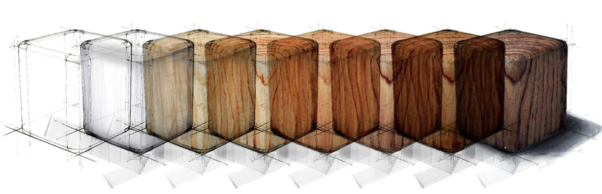
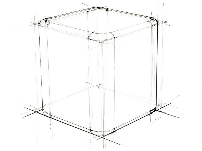
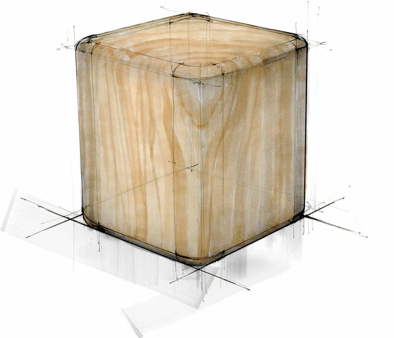
First, sketch the form that you want to apply your wood grain to. This can be anything you want, but here I’ve started with a cube whose corners have been sanded smooth.
I used a .05 Copic fineliner to get the 3-point perspective right, followed by a Micron #1 to darken the ground and shadow edges.
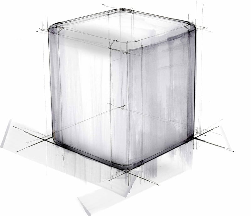
Before adding any color, lay down some basic shading using grey markers. I often use Copic wide markers for this because they save time and add a lot of natural variation.
Light rays bouncing around an environment are unable to get into tight corners and crevices. This creates what is called an occlusion shadow. Here, we’ll see occlusion shadows where the bottom fillets start to meet the ground.
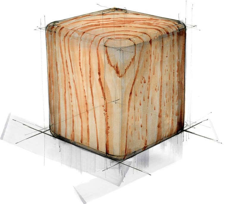
Now, visualize the wood grain pattern you want to create in your mind’s eye and apply the lightest wood tone you’ll be using. I used a Copic E34 marker in this case.
Draw slowly and allow your hand to waver. This will create natural variation in your strokes for a more organic look and feel.
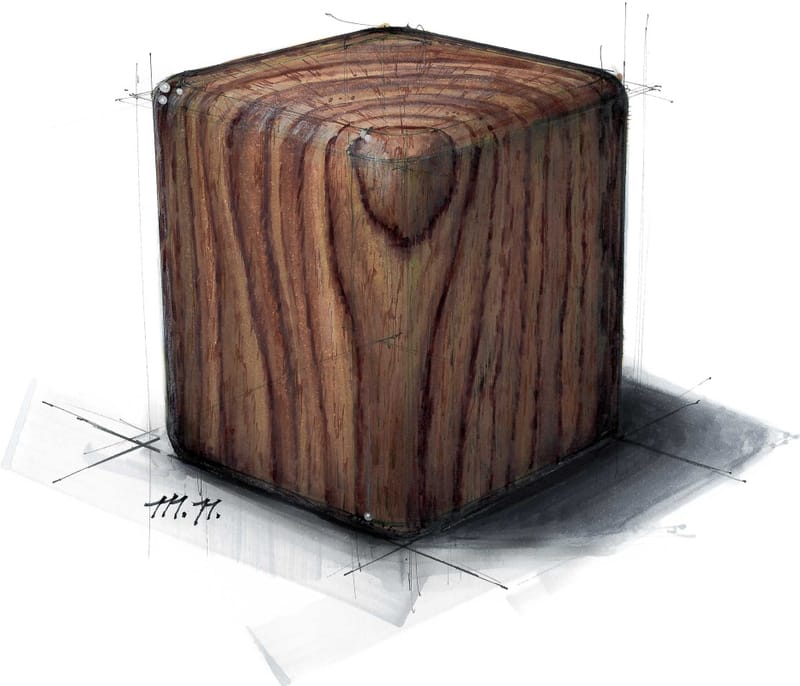
Take a look at the cube below. Its top surface is a horizontal cross-section of the tree it was cut from. Just like a tree stump, it clearly displays the tree’s rings.
The sides of the cube are vertical cross sections of those rings. Use a marker that is a few shades darker than the one used in the last step to draw lines that separate each ring section on your cube.
Tree-ring coloration can vary depending on many factors. Spring/ Summer rings tend to be lighter than Fall/ Winter rings. Environmental factors such as moisture and sunlight also influence the coloration. That means it’s up to you to tell your tree’s story.
Add tonal variation to the tree rings, Making sure that the rings connect logically. If you’re drawing the cube below, they’ll connect from the left to the right side over the top of the cube.
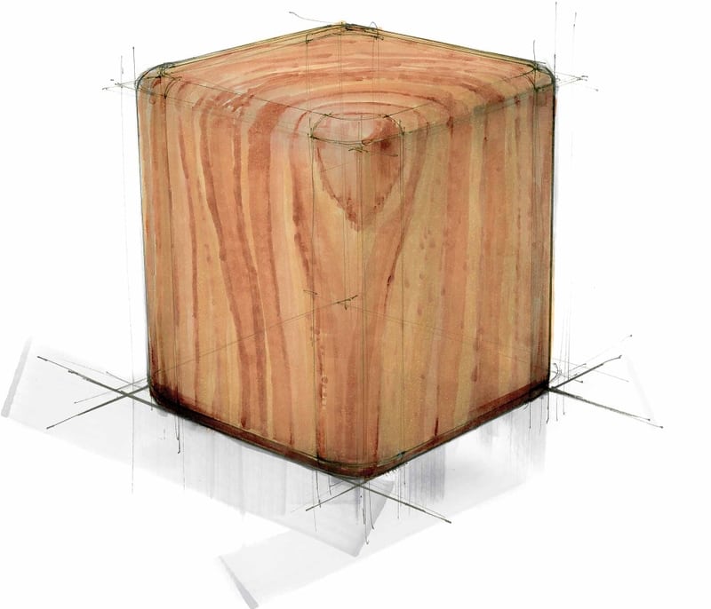
Now use your darkest wood tone to bump up the contrast of the ring line. Remember to take your lighting into account.
One of the hardest parts about drawing wood is creating a grain pattern that looks natural. Be sure to incorporate some asymmetry, but don’t overthink it.
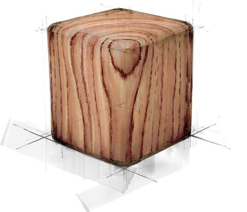
Use your mid-tones to blend patchy areas together and soften the edges of the dark grain lines. Running the marker over the same path several times will saturate the paper, causing the inks to blend together smoothly.
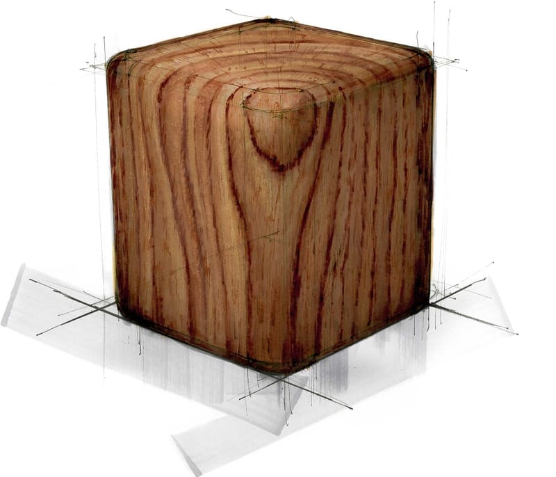
Get out your magnifying glass. The tiniest details can have a huge impact. I’ve used a sepia-toned Micron 005 to add an extra layer of texture to the grain.
Cast a shadow onto the ground plane to add dimension and ground to the object. For the final touch, use a white pencil to highlight the upper left edge and add reflected light to the bottom edges.